
Practical Skills
Practical Skills Development - Symbols and Tweens In Adobe Animate


For today's experiment I will be attempting to use symbols and tweening to help my animation process quicker, more efficient and more consistent between frames. My animation process before was using frame by frame animation so the symbols should make this much faster and easier. If I succeed with my experiment I can use symbols to help keep my character consistent between its animations for the mechanics. My plan for today is to take my research and apply it to a simple walk cycle along a path or road to show that I can apply symbols to complex and simplistic motions.
For my research, I'll be looking into Adobe Animate's video called "Adobe Animate | Types of symbols in Animate, Graphic and Movieclip" and TipTut's video called "Adobe Animate 2021: Symbols and Tweens [#3] | Beginners Tutorial". I used Adobe's video to teach me the differences between Graphic symbols and Movie Clip symbols. For example when editing the attributes of either symbol you can notice that there are
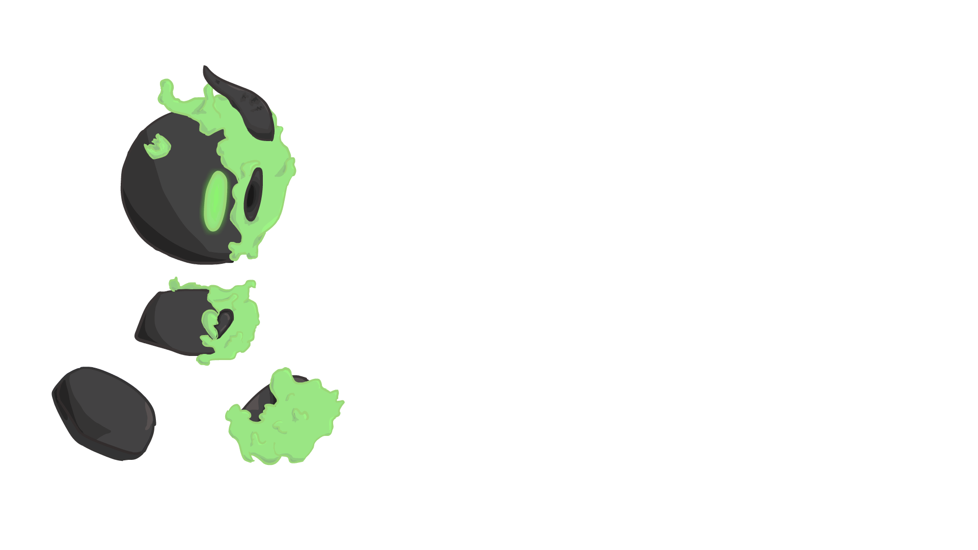
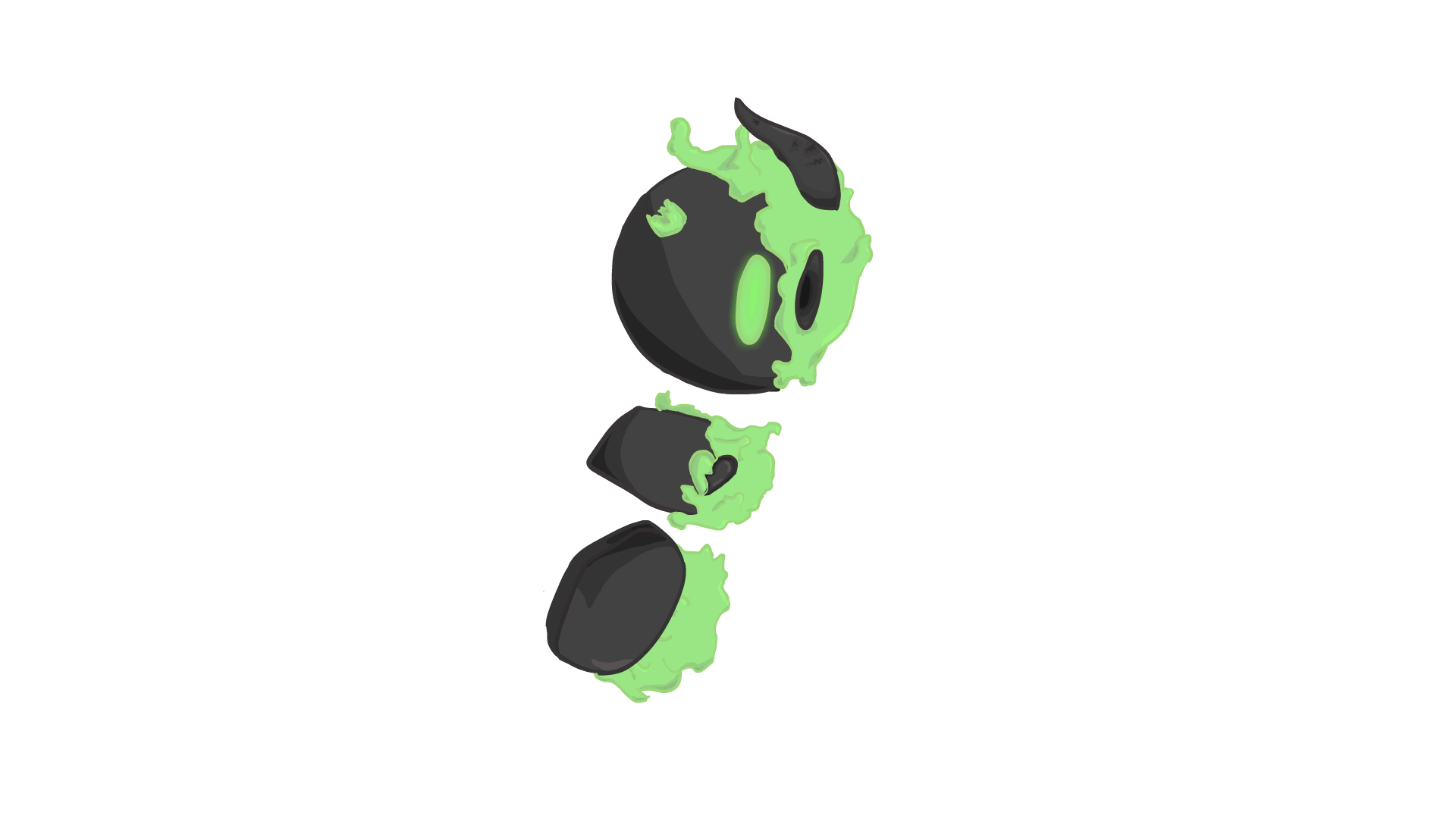
different features to each. The Graphic allows you to change the timing and looping settings to give you more control whereas Movie Clips have settings to edit or add to the look of your asset, like glow, or drop shadow. In TipTut's video I was given an in depth tutorial to show me how to use these tools alongside tweening in a current project. They also taught me to use shape and classic tweens and why Adobe can't add these tweens under certain circumstances. The shape tween is mainly used for shape's which in Adobe Animate is anything that has been drawn on the canvas wether stroke or fill unless you have already converted that shape into a symbol at which point the tween won't apply. The Classic tween has the opposite problem where it is mainly used on symbols rather than shapes. Now that I understand that symbols are more like a folder rather than a permanent asset (almost as if it was locked off), I can use this in my advantage to help keep my timeline clean and animate an entire section or limb in a few seconds rather than hand drawing each individual frame and creating inbetweeners manually.
If I had to rate my work from today on a scale of 1 to 10, I think that I'd have to give it a 6 or 7 out of ten. I believe that I could have done more to explore like using Movie Clip symbols however, there is definitely potential in this GIF. I think it needs some secondary animations, a bit of motion blur or smearing and perhaps a bit of tweaking in the timing.
Adobe appeared to be very intuitive with this experiment and the mac didn't appear to get any slower than usual so I really can't complain with my tools and equipment today. I think the technique of symbols worked really well but can look a bit static, it needs more fluidity to make it feel more alive.
I didn't really have many problems this time around however, I did struggle with colouring and making the character less harsh. I fixed these problems but creating symbols within symbols, that way I could move the head and the line art plus the colour would move. I didn't know I could do this until I was told that symbols are like folders. With the harsh lineart, that was a very simple fix. I looked at my fully rendered asset on my Full Treatment and realised I didn't include a bold black lineart. So to fix this in my GIF I just selected my line art and changed it a shade darker than the colour next to it. This really helped to soften and unify the character.
Next time I am going to go in after the fact and edit or add to the inbetweeners so that I can help make it look less static and more alive or real. I also want to edit the timing as it feels kind of slow for a walk cycle and it's feeling more of a power walk or a hurrying motion so I should look into how posture can affect the motion of a walk cycle. I'd also spend time shading, lighting and creating a background to support the character.
Practical Skills Development - Experimenting with Unity UI
The skill I am developing today is navigating Unity Game Engine's Ui so that I get an idea of how it works. More specifically I'll be learning how to add assets, change the sprites of those assets and trying to add a hitbox and possibly how to add programming to the game. I don't expect to create much today, however if I can create a basic platform and player object then I'll be happy with my deep dive. I'm looking into Unity's UI to see just how user friendly it is and to see the main layout to familiarise myself with it to make it easier to use during production.
To get a very basic knowledge of Unity's layout and functions, I watched a video titled "Unity Tutorial 2021: A beginner guide for idiots" by The Point & Click Devlog. This video was super easy to follow with all the teachings happening in real time. I have learnt how BoxCollider2D's work, RigidBody2Ds, game view and scene view, how sprites can be added and coloured and how to add game objects. For example, BoxCollider2Ds create a collision component around the object so that it can collide with other game objects or trigger a C# script. Their example of this is the coin system in mario.
RigidBody2Ds apply physics to the object which allows them to fall and act with gravity.
Thanks to this research I'll be able to add objects, change sprites and keep my objects organised within the Hierarchy. It's also going to make me more efficient when creating my game in my project.


By doing this practical skills experiment, I am incredibly excited to get started with creating my project. As for what I have created today, there's not much of it but I feel that I have gotten a lot more comfortable when it comes to Unity. Unity appeared to be really simple and easy to use as most functions are in view when you first open a Unity project. However anything you need to add e.g. empty objects, game objects, cameras etc, is just a right click away in a well organised menu splitting 2D objects with 3D ones. Unfortunately, I was unable to open a script editor so I'll need to download one like Visual Studio in the future if I want to add player movement. Other than the lack of scripts to be able to code movement, there wasn't many issues I had today. However, I did have an issue with downloading assets from the Unity asset store so instead I did a quick search for any form of sprites so that I knew I could change sprites so that I had that knowledge for later. Next time I'm going to download Visual Studio so that I can program a custom player and camera movement so that I can experiment with C#.
Practical Skills Development - Colouring and creating Environments
Today I'll be creating a custom background in a different production style than I would normally use for backgrounds. Instead of going from lineart to colour immediately, I will be trying to shade the background in grey-scale and then adding a blending option of colour after the fact so that the colours keep the values that have already been painted in. hopefully this will help me lead the viewer's eyes to where I want them to. I will create a simple background that forces the viewer to look more towards the centre of the background. I want to theme this background around organic fungi so that I can use lines of direction within the composition to further help lead the viewer in. I am doing this so that I can see if it works and whether I can use this way of production to get people to focus more on the foreground of my game rather than the background.
To see someone more experienced with this production style I decided to look at Ariabba video called "Painting from GRAYSCALE to COLOR | TUTORIAL". This video talked through their process in colouring and lighting. They start with creating thumbnails of what each colour scheme will look like and allowed their instagram followers to decide which one resonated with more people. They kept their original grey-scale in a separate layers and used Procreate's selection tool and blending modes to colour the image whilst keeping the original layer and colour values. Now what I found interesting is that they created a duplicate of a flattened image of the piece and then played with the brightness and hue balance. They then created a separate layer and attached the lighting layer as a clipping mask so that they could paint in the sun. They then did the same for the sky's reflection on the environment.
I'm going to use this technique in my project so that I can get the most contrast out of my backgrounds and so that it is much easier to light the scene.

I think that my final piece does what I set out to do as it clearly draws your eyes towards the centre of the piece. I even added a bit a of noise and some chromatic aberration to help the foreground blend in. There are a couple of things that I don't like about my work. The main one being that I don't like the brush that I chose to use for today. To me it feels more like a sketching brush however I used it as a colouring brush which just doesn't sit right with me. However, the tools of Procreate were great to use and super easy to manipulate, with everything being at the touch of a finger. One of my favourite tools is the smudge tool as it is so nice to be able to blend colours to my will instead of using gradients and blur tools. Now when it comes to problems, my biggest one was how I would create a full environment and draw it within the image. So I just decided to focus on what I set out to do which was drawing the eye in. I'd still wish there was more to the piece however, as it seems a bit bland. I also had my lineart as a blue originally but thought that it would fit my project and its style if I coloured the line art as a darker colour than the adjacent colour. This also fixed the issue of my lack of skill when painting without lineart as I could just colour my lineart too give it that extra contrast to help them stand out. Next time I'm going to plan out my scene and use brushes that I enjoy and one's that fit the scene. I am also going to experiment more with colour so that I can see what works and what doesn't so that I am able to decide on what feeling I want the audience to feel


Day One of Production-Creating frames for mechanics


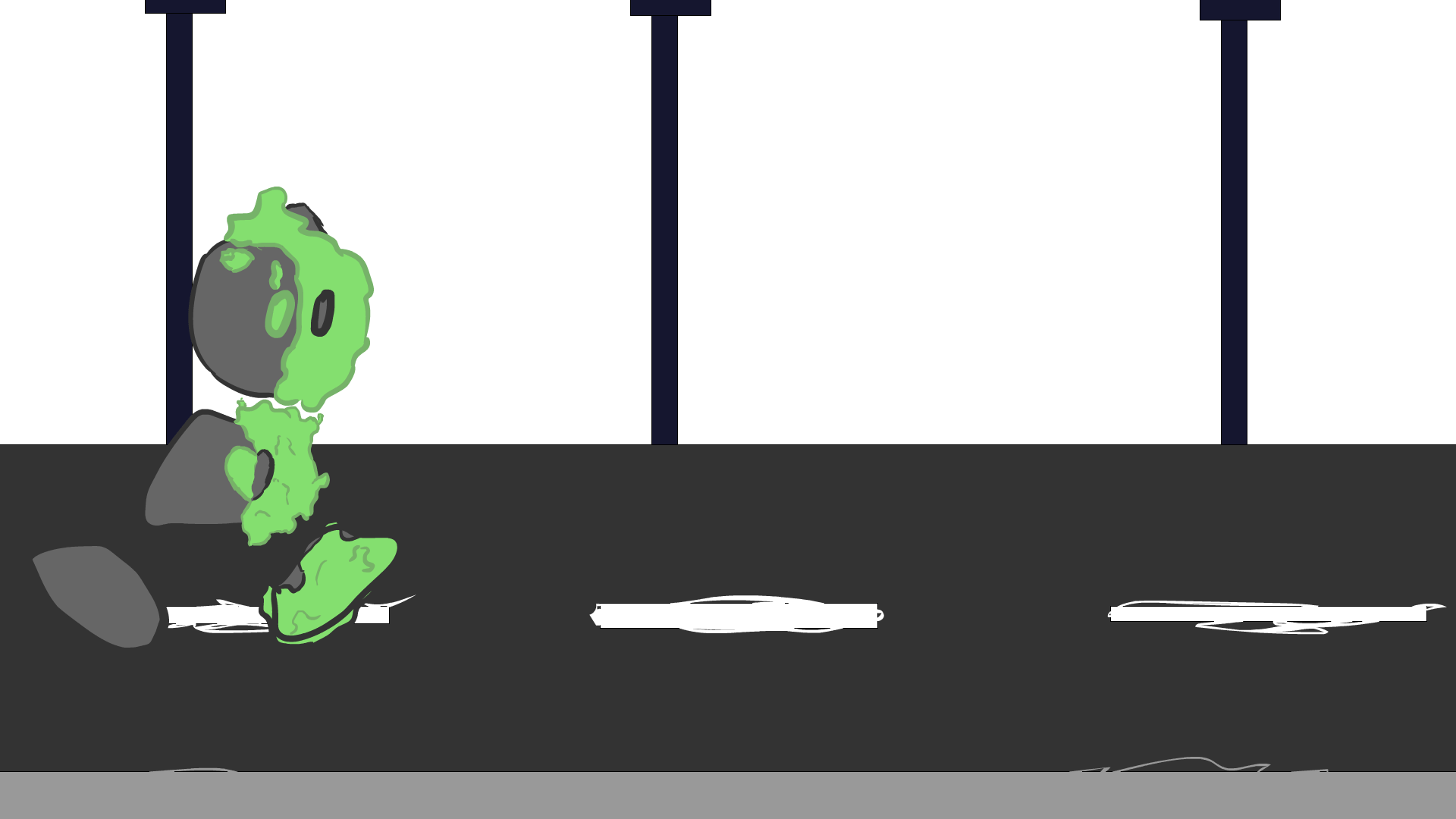
As Today is the first day of my production, I am developing my skills with symbols in adobe animate by animating the walk and run cycle's of my character so that I can import it into Unity later on. By using symbols instead of frame by frame and hand drawn animation, I can shade and highlight any and all details I want without jeopardising the look and consistency of my character and my time as a whole. By animating in symbols I'm able to move each limb and piece of my asset for numerous different animation cycles. By doing this I can have an idea of what it will look like in my project. I can then import these frames into Unity as a sprite sheet so that my character has movement.
To make sure I knew how to import my animations into Unity before creating them, I looked into Brackeys video on 2D animation in Unity. From this I understood how Unity has its own sort of Timeline and how I wouldn't need to animate in a bunch of frames as I would need to import it into unity as a sprite sheet. I will come back to this resource when importing the animations so that I can make sure I am doing it correctly. It also showed me that I can programme the movement first and then add the animations and adjust their timings.
I think my my work looks great, I'm quite proud of my work today as my walk cycle has a bounce to it and my run cycle feels imperfect in its movement which makes me think my animations feels alive. It was so much quicker and easier to use symbols that I wish I understood them sooner rather than later. I was able to complete two cycles of animation in a day which would have taken me three weeks to make. The only major problem I had today was that documenting my process was difficult to remember so I just decided to screen record my process and then speed it up. Next time I want to go in and polish these animations with secondary animation of the ghostly, soul-like half of the character, so that it will move with the motion you're moving in.
Feedback
You're walk cycles look like they are done professionally. The character design also fits the indie 2D platformer media your project will be in.
If there is something to critic about your work so far, I'd have to say that I would want to see what the background will look like so that there is a clear image of what the final product will look like. As you're having a dark character on a dark background, you might want to add a glow effect as if the green stuff emits light.
I will say that the art style reminds me of cuphead which makes sense as it's a vector based platformer. I also thinks it suits the brief as I don't think anyone else is using Unity nor creating a playable game.
Response
I'm glad to know that my efforts aren't going to waste and that others like this character as much as I do. I original plan was to have him illuminate the area around him to help the player see. If I can't do this then the next best thing is to just have the background as a few colour values higher than the character.
Changes
I decided to change to art style of my character and the overall project as it was easier to recreate in Adobe Animate and it shows a less sketchy and a much softer feel to it which will help the player feel more relaxed when playing. It should also add that small element to get some younger ages to play the game. I'm hoping that the art style is also something that will get people to love the character and want to follow this character's Journey.
Day Two of Production-Finishing game assets and starting background.
Today I will be focusing on completing any assets that I may have yet to complete for example the interact animation and the jump animation. After this I'll be getting three backgrounds done for my three levels. I'll be using Photoshop for all of my non-moving assets. By making the rest of my assets I can then import them into my unity scene.
Originally I was unsure of how I was meant to Import my assets into unity. I was aware that the files was meant to be in a PNG file but whenever I tried to export them the symbols wouldn't show up. And thus I headed to Google for a simple explanation as to how to do it. From this search, I was sent to Adobe's official site where a step by step tutorial was given to me and made it incredibly simple on how to do it. https://helpx.adobe.com/bg/animate/using/exporting.html. Thanks to this I learned that it is as simple as a right-click on the symbol of your choice.
I think that I applied a good ease in and ease out of my interact animation and I have a good background aesthetic for my game. By using Photoshop for my backgrounds instead of Animate or Illustrate. It allows me to draw with a program I am comfortable with but it also allows me to add effects and modify hues and lighting incredibly easily to see what works best. I did struggle to get the feel I wanted with the colours so my solution to this was to create different versions of the background on different hues and to see which one clicked.
Next time I would like to research how to import a background into Unity so that I know the size needed for my project and maybe how to do parallax my background in the future.
Feedback
The walk cycle is very well executed and so is the character movement.The amount of work done looks enough to be on the way to a third finale of the project and the work pace is very consistent.
The character design is very original,as well as the art style used. The colour scheme matches it well.
The background if not going for a very cartoonish style, you could have modelled 3d buildings and adjusted the render of the buildings in photoshop as line art to have precise sketches for background.
Feedback 2:
I really like the design of this character, It's very new and different and seems like a great original idea that you've thought of. However with how detailed the character is, the background could look cleaner if isometric drawing style (apologies if this isn't the correct wording) was used to create a cleaner look and would also just make it easier to visualise how buildings could look from a certain perspective.
Response:
I'm glad people really like the character design and the style as it is what has the most thought put into it. I personally love my character especially as it is one of my first ever character design processes and I think it went really well. Now when it comes to the background, the biggest thing people had a problem with was the style of the buildings as it just didn't fit with the actual character. Fortunately, this is because it wasn't finished and was in fact just a sketch so that the idea is on paper. Now I know others tend to sketch in a colour however I enjoy sketching in the black brush instead so next time I need to make sure that I clarify it is the sketch before getting feedback on it.


Changes
Today I looked back at my original idea and decided to change the setting to a city landscape instead of an abandoned warehouse as the original setting could encourage people to explore abandoned builds in real life. I also changed it because I felt that this background felt a lot more homely and inviting to new players as most people live in big cities like this so they were able to step back from the busy life and look at the beauty that the city can hold.
Day Three of Production-Finishing background and other assets
Today was a half day so I decided to finish off the background designs for my game. I'll do this by opening up my previous Photoshop files so that I can finish the shading, lighting and colour composition of my first background and then I can start on the next two backgrounds that I need. By doing this I'll be learning how Photoshop's layer settings and clipping masks can transform an image and unite the colours within it.
I used my primary research the perspective on my Full Treatment with a mix of the 3D models I used to created those references. These allowed me to get the general scale and perspective of the buildings for my background and it helped me separate the image into layers e.g. background, midground and foreground.
I ended up liking the designs I created for the background except the underground background as I needed to put in some more effort into it as it was quite rushed. Other than that I feel as though the backgrounds would look more in suit with a poster than a game background as I am unsure as to how it will translate over in Unity. Making them was rather simple with Photoshop as I could use and manipulate layers incredibly easily so that I can get the desired look of my image in real time. I found that my preferred brushes mixed with the smudge tool came with an interesting and unique style. The issue of today was that the buildings started to morph together with very little contrast between them with the shape of the buildings also becoming harder to read. To solve this I took a little inspiration from the animatic style of Szin on YouTube (Example shown in The Story of the Tonight) where they use pure white to highlight the edges that are struggling to stand out. Next time I want to research into what makes a good Game background and how I can make them feel like a game background in a simplistic style so that there is more attention drawn onto the player character.
Changes
When finishing the textures, I ended up forgetting to draw a light texture, so instead of having to draw two new textures, I instead decided to draw spikes instead of electricity as the danger. However I don't like the texture so this may change in the future.
Day Four of Production-
making sure Unity works
Today I don't plan on making any changes to the production progress, in fact today is going to decide whether or not creating a playable game is viable or not with the time and more importantly the resource I have. Today I focusing on getting my C# program working so that I can edit the code in the script. So far I have Unity and Visual Code however I can't seem to get visual studio to open the script from Unity and whenever I try it creates a blank document. I originally thought that it had something to do with the preferences of my project folder but that didn't seem to affect it in anyway. Therefore I will need to do some research into why this isn't working today. Now whether I can get this to work solely depends on whether I make a game or an animation with the sprites I have already created and that is why I am dedicating today to do this.
For this I went to research as I'm sure others have had the same issue and I guess I was right as I quickly found a video by BMo called "How to set up Visual Code for Unity Tutorial" where it showed how to fix this issue. However I had to watch it a couple of times for me to realise that Visual Studio wasn't the program I needed but rather the lighter version called Visual Studio Code. Is was a basic mistake and I'm sure you can use Visual Studio with Unity but Visual Studio Code looked like it was going to solve my issue much quicker. So my next step was downloading the new application so that I was able to use it. Now I don't download much off the internet as I've always been scared to death of the risk of viruses but this was a product made by Microsoft so I trusted it more but that didn't mean I had no idea that I had to open it after it downloaded to open the installer. That lack of knowledge hit as it was so simple. But thanks to this video I was much closer to seeing whether or not my game was a viable option and it keeps looking like a yes.
Thanks to the research I did I can now start programming my game as soon as I get in next week. I'm really happy as my dream of making this a game is coming closer and closer to a reality and I can't help but be excited for it. It was super simple to download the app as it was literally a button and it only took a double click to check that the program actually opened in the app. This entire day was a problem solver and I'm glad I was able to solve it as I could now crack on with programming. I did however have to change the preferences again as I wasn't able to check whether it was working or not until I remembered to do that. Next time I would make sure that I fixed this issue before I started animating and drawing my assets as some of those assets would have been a waste.

Day Five of Production-Importing into Unity
Today is the day I have been waiting for since the start of the project where I jump head first into Unity and I start actively programming in C#. As someone who has never touched this programming language and has close to little experience in programming besides python. By learning to program in C#, I will be able to make my creation come to life with a custom and easily changeable movement system so that I can get a right feel for my game. I'm making the settings easily changeable via a Serialise field so that I can edit the movement speed in unity rather than hopping back and forth from coding to game engine.
For my research in how I can create a Unity game, I looked towards Pandemonium's channel and more specifically, his playlist called "Unity 2D Platformer for Complete Beginners" where it teaches you the very basics of Unity and C#. These videos taught me how to add player speed in a serialised field and applying jumping, grounding, camera movements and textures to my project. Thanks to these videos I started to understand C#'s programming language so that I could manipulate the code to give me a desired movement pattern that I had wanted.
I got a lot done today and I'm glad I got it done so that tomorrow I can focus on improvements, but despite this I am still incredibly proud of my game that has started to become a reality. Unity's basics and components are really simple and easy to use. For example, you would add a RigidBody2D if you want your object to be affected by Gravity, and add a BoxCollision 2D so that you can collide two objects. However C# may have been a very difficult language to understand to the point where I needed to keep coding to start reading and understand what each line of code did. The technicalities of each word being a certain capitalisation or else it wouldn't work. There was no give or "wiggle room", it had to be exact. This was extremely annoying but I went back to my code so that I could figure out what was wrong and fix it.


Changes
As this was a very big step into a world in which I have little experience, This is probably the biggest changes I have made to my game in comparison to the original idea. First off, I'd rather improve may game rather than add more and more features that have their own bugs and issues. Therefore, I have decided to cancel the movement upgrade because of a lack of time and lack of understanding on how I would achieve this. I could still have a secret wall but I didn't really see a point in doing that as there is nothing for the player to do.
I also had to say goodbye to the idea of interacting with buttons throughout the level and subsequently the boss fight. This is mainly to do with lack of knowledge and lack of time. I also haven't fully thought out the idea so I believe the game would be better without it.
The last things that I scrapped were the swinging platforms and the electricity that zaps you. I did this because I'm not sure how you would add a moving platform let alone one that looks and feels as though gravity is affecting it. I got rid of the electricity as it would just add more issues later on. For example, a health system, respawn mechanic, menu screen for when the player decides to leave, knockback, particles and so much more. So I decided to scrap the idea for this game as there is only a day left.
Day Six of Production-Improving Unity Project
Today I am working on bug fixes, improving mechanics and changing the background and other assets to better suit the game. I am going to get two of my peers to test play the game and I want to code a new jump script so that i can make the jump feel a lot less floaty so I want to find a way around that. I am doing this so that my game is more familiar with people who play the genre who can recognise if a game's mechanics feel like there is no weight to them. I'm hoping that today really wraps up the game ready to be published.
First objective of the day is changing the jump to have more weight which is well explained by Board To Bits Games in their playlist Better Jumping in Unity where they explain how we are used to games that fall quicker than they jump. They also show how to improve the jumping and colliders so that the player can't endlessly jump forever. Using these as examples for my own code I went back and commented out my previous jump mechanic.(changed the code to a comment so that I still had the code but it didn't affect the game) This is so I could test out how effective it was which will really help my game feel polished if implemented correctly.
I also looked into Thomas Brush video on making game backgrounds so that I can improve my own instead of a repeating tile-like background with seems along it. This video helped me understand how to use saturation and colour to create the effect of a layered background. I want to implement this method into creating my own backgrounds and then I want to add gradients between them so that I can have a seamless background.
The information I got out of the play testers was that the character stuck to walls and that some corner pieces didn't have colliders on them yet. These were pretty simple fixes as i just needed to add the BoxCollider2Ds to the corner and add a physics component to the player.


I think that the jump mechanic is incredibly addicting to use and adds so much to the experience of the game.
I am also loving the seamless backgrounds. There is always things to be improved however. For example the jump animation was cut off when I commented the code out. It was surprisingly easy to do as I only had to add scripts instead of replacing them. Unity was also very helpful when adding the background as I just needed to add value to the v axis so that the layers are arranged correctly. The issue I had today was actually publishing the game from Unity. Every time I built the game into a WebGL format, it would build the wrong version of the project. I tried six different builds until it worked. It was a basic fix of unchecking the tick box for Sources.
Next time I want to learn more about Unity's animators, controllers and links with C# scripts so that I can add more animations for jumping and for falling. This is so that the player feels more in tune with the characters movement and it would help the character feel more alive.


Changes
Today I switched the textures to an updated version as I was originally missing corner pieces. I also updated the background simply because the other version would have to stretch and squash or tile repeat in order to fit in the level so I just remade the background to something that could repeat consistently.